Choosing Paint Colours for Small Rooms: Decorating Tips for Poole Flats and Terraces
Struggling to choose paint colours for small rooms? Our practical guide helps Poole, Bournemouth and Dorset homeowners pick shades that make every space feel bigger.

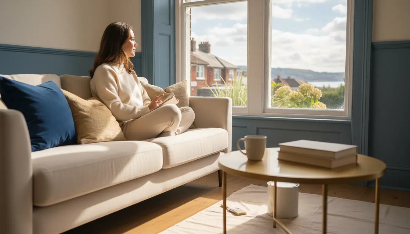
Small rooms don't have to feel small
A compact bedroom, a narrow hallway or a bijou living room in a Bournemouth terrace can feel genuinely spacious with the right paint colour. It isn't magic. It's understanding how light, tone and contrast work together on your walls.
We've decorated small rooms right across Poole, Bournemouth and Dorset, from snug box rooms in Broadstone to tight hallways in Christchurch, and the questions are always the same. Which colour? How light? What about the ceiling? This guide pulls together what we've learned on the job, so you can walk into a paint shop (or browse online) with a clear idea of what you actually want.
What paint colour makes a small room look bigger?
The short answer: light, cool and low-contrast. But let's break that down properly.
Light colours reflect more light. A pale shade bounces natural and artificial light around the room, making walls feel further away. Bright white, soft off-whites, pale greys and gentle warm creams all do this well. Deep colours absorb light, which is why a dark navy bedroom can feel cosy but also a bit cave-like if the room is already small.
Cool undertones recede visually. Blues, greens and grey-leaning neutrals tend to push walls back. Warm tones, reds and oranges advance. That's why a cool pale sage can open a room up in a way a warm terracotta might not.
Low contrast keeps the eye moving. If your walls, skirting boards and ceiling are all close in tone, the eye doesn't stop at the boundary of each surface. The room reads as one continuous space rather than a series of boxes stacked together.
A few colours that consistently work well in small rooms:
- Soft whites with a warm or neutral undertone (avoid stark blue-white in a north-facing room, it can look clinical)
- Pale greens such as sage or mint
- Dusty, muted blues
- Light greige (grey-beige) tones
- Warm off-whites like linen or parchment
The ceiling matters more than people think
Most people focus on the walls and forget the ceiling. In a small room, painting the ceiling the same colour as the walls, or just one or two shades lighter, removes the hard visual stop at the cornice line. The room feels taller and less box-like.
A brilliant white ceiling in a room with coloured walls can actually make the ceiling feel lower, because the contrast draws your eye straight to the join. Try bringing your wall colour up and over, or choose a ceiling shade that's a lighter version of the same hue.
This works especially well in small bedrooms and bathrooms across Dorset, where older properties often have lower ceilings to begin with.
What about the woodwork?
Painting skirting boards and door frames the same colour as the walls (or very close to it) removes another visual boundary. The room feels calmer and more continuous. It's a technique that works brilliantly in narrow hallways, which are one of the most common small spaces we're asked to freshen up.
If you want contrast on the woodwork, keep it subtle. A white wall with a slightly deeper white or very pale grey on the skirting reads as intentional without chopping the room into pieces.
For more detail on how long hallway decorating takes and what's involved, have a read of our article on how long it takes to decorate a hallway, stairs and landing in Poole.
What's replacing grey in 2026?
Grey has dominated UK interiors for years, and it's still a safe, versatile choice. But the shift we're seeing in homes across Bournemouth and Poole is towards warmer, softer neutrals and nature-inspired tones.
Warm whites, earthy taupes and muted greens are appearing more and more. Soft terracottas and dusty pinks are popular in bedrooms. The move is away from cool, stark greys and towards shades that feel lived-in and calm.
For small rooms specifically, the warmer neutrals are a good evolution from grey. They still read as neutral and uncluttered, but they add a sense of warmth that cool grey sometimes lacks, particularly in rooms that don't get much direct sunlight. Many homes in Hamworthy, Canford Heath and Ferndown face north or have limited glazing, and a warm neutral can make a real difference there.
The three-colour rule: a useful starting point
The three-colour rule is a simple interior design principle: choose three colours for a room and use them in a roughly 60-30-10 split.
- 60% is your dominant colour, usually the walls
- 30% is your secondary colour, often the woodwork, furniture or soft furnishings
- 10% is your accent, a cushion, a lamp, a piece of artwork
In a small room, keeping the 60% (walls) and 30% (woodwork/large furniture) close in tone does the heavy lifting. The 10% accent is where you can introduce something bolder without overwhelming the space.
This isn't a rigid rule, but it's a helpful framework when you're standing in front of a wall of paint chips feeling overwhelmed.
What a freshly painted small room can do for a home
Jo Hatch asked us to decorate her son's bedroom and a bathroom, both spaces where getting the colour right really matters. Here's what she had to say:
What can I say, not only was he super helpful and polite, Aaron did a brilliant job of decorating our son's bedroom and a bathroom! Would highly recommend and we've already got the next lot of decorating lined up for him
That's exactly the kind of job we love. A child's bedroom is a small, personal space where the colour sets the whole mood of the room. Getting the prep right and the finish spotless means the colour can do its job properly.
Practical tips before you commit to a colour
Test on the actual wall. Tester pots exist for a reason. Paint a large patch (at least A4 size, ideally bigger) directly on your wall and look at it at different times of day, morning light, afternoon, evening with lamps on. Colours shift dramatically depending on the light.
Check the undertone. Hold your tester patch next to a pure white piece of paper. You'll see whether the colour leans warm (yellow, pink, red) or cool (blue, green). That undertone matters for how it sits in your room.
Don't trust the chip alone. Paint chips are tiny and surrounded by white card. On a full wall, the colour will look more saturated and more intense. If you're nervous, go one shade lighter than you think you want.
Consider the finish. In small rooms, a matt or soft-sheen finish tends to work better than a high gloss on walls. Gloss can highlight imperfections and create reflections that feel busy. Soft sheen gives a gentle glow without the drama.
Think about the whole journey. If your small bedroom leads off a hallway, think about how the two colours sit together. They don't need to match, but they should feel like they belong in the same home.
Calming colours for small bedrooms
If the room is a bedroom, calm matters as much as space. Soft blues, dusty lavenders, warm whites and pale sage greens are all associated with rest and quiet. They also tend to be low-saturation, which means they don't compete visually and the room feels settled.
Avoid very bright or highly saturated colours in a bedroom you want to feel restful, even if the room is a good size. In a small room, a saturated colour can feel relentless.
If you're refreshing a rental property between tenancies, neutral and calming colours are also the safest bet for broad appeal. We've written more about that in our landlord's decorating checklist for Dorset.
Frequently asked questions
What paint colour is best for small rooms? Light, cool-toned or warm neutral shades generally work best. Pale whites, soft greys, muted greens and warm off-whites all reflect light and make walls feel further away. The key is keeping the overall tone consistent across walls, ceiling and woodwork so the room reads as one continuous space rather than a series of tight surfaces.
What colour should you paint a small room to make it look bigger? Painting walls, ceiling and woodwork in the same colour or very close tones removes the visual boundaries that make a room feel confined. Cool, light shades recede visually, which helps. A pale sage, a soft blue-grey or a warm off-white on all surfaces, including the ceiling, is a reliable approach in the smaller rooms we see across Dorset homes.
What colour is replacing grey in 2026? Warm, nature-inspired tones are gradually taking over from cool grey. Earthy taupes, muted greens, warm whites and dusty pinks are appearing more frequently in homes across Bournemouth and Poole. They offer the same neutral, uncluttered feel as grey but with more warmth, which suits rooms with limited natural light particularly well.
What is the three-colour rule in interior design? It's a simple guideline: use three colours in a 60-30-10 split. The dominant colour (60%) covers the walls, the secondary (30%) covers large furniture or woodwork, and the accent (10%) appears in smaller details. In a small room, keeping the 60% and 30% close in tone does the most to make the space feel open and calm.
Ready to see how the right colour looks in your room?
Choosing the colour is one thing. Getting a clean, even finish that does it justice is another. We work across Poole, Bournemouth and Dorset, including Wareham, Parkstone, Hamworthy, Canford Heath, Christchurch and Ferndown, and we're happy to talk through what you have in mind before you commit to anything.
Send us a few photos and we'll give you a free, no-obligation quote. Call us on 07778 228478 and let's get your room looking exactly as it should.